Welcome to
our brand.
This manual is printed in the brand's own ink. Use the Fun / Pro toggle in the header — the whole document re-themes, and every example of the voice switches register with it.
Section 01
Mission & Vision
Who we are
We believe Sardinia can be more than a beautiful island in the heart of the Mediterranean.
Entrepreneurs Meet is a community-driven non-profit connecting capable, curious, and global-minded people. We are not an institution. We're a movement of individuals who chose this city and now want to see it thrive.
Everything in this manual exists to protect one idea: that good ideas and good people should find each other — and that the place where they meet should grow because of it.
Our mission
To put Cagliari on the world map by attracting talent, values-driven individuals, and capital — while ensuring that everyone who arrives finds belonging, purpose, and the opportunity to contribute to the city's shared growth.
We foster a community that unites newcomers and locals in a spirit of collaboration, creating an ecosystem where innovation enhances life and people shape progress together.
Our vision
A Cagliari that stands as a Mediterranean capital of ventures — inclusive, cultured, and globally minded.
A city where knowledge, creativity, and enterprise come together to define prosperity. Where people come not only to live, but to think, create, and belong.
Section 02
Story & Manifesto
Where this comes from
It started with a simple question: why are so many of us building alone?
Cagliari is full of entrepreneurs — founders, freelancers, consultants, creators, investors. People who moved here from somewhere else, or who grew up here and decided to build something of their own. For a long time, there was no obvious place to connect.
So we made one. What began as a small gathering of curious founders has grown into a community of over 200 members from more than 15 nationalities — 22+ events across 16 venues, and 30+ guest entrepreneurs who've shared their journeys.
And we're just getting started. The brand described in this manual carries that story: informal in its heart, serious in its intent, and always local to the place that made it.
The manifesto
We are the ones who choose to act.
We see Cagliari not as a quiet corner of the world, but as a starting point for change. Being entrepreneurial means owning a mindset — the will to create, to connect, and to shape the future with intention and care.
We welcome those who arrive ready to share their knowledge, energy, and hope. We believe in the duty to make our presence count: to help others settle, to offer ideas generously, and to celebrate progress together.
We are here to make Cagliari a place that grows with its people — a living ecosystem of curiosity, creativity, and community.
We are Entrepreneurs Meet. And this is only the beginning.
Section 03
Values
What we stand for
Six commitments, stated plainly.
The stuff we actually believe.
The values are constant across both modes — only the phrasing flexes. Toggle the mode to see the same convictions in the other register.
Inclusivity
We welcome those who seek to belong and contribute. This community is for anyone with an entrepreneurial mindset — whether you were born here or arrived yesterday.
Collaboration
We grow through shared ideas and collective action. Your success strengthens the whole community.
Human-centred innovation
We build systems that serve people, not the other way around. All of it should make life better, not just more efficient or more profitable.
Sustainability
We think long-term, balancing progress with preservation. Sardinia is a Blue Zone for a reason — and the principles that make it special are worth protecting as we build something new.
Integrity & contribution
We measure success by the quality of interactions we facilitate and the positive impact we create. Not vanity metrics. Not hype. Real value.
Authenticity
We don't need perfection — we need progress. We share the struggles alongside the wins.
Collaboration over competition
We rise together. Your win is our win. The best ideas happen when different people from different worlds sit at the same table and actually listen.
Authenticity over perfection
We don't need perfection — we need progress. We talk about the failures alongside the wins. That's not weakness — that's the first step to overcoming it.
Action over theory
Ideas are great. Execution is better. We help each other move forward — introductions, resources, honest feedback, and the gentle push we all sometimes need.
Open minds over closed doors
Everyone has something to teach. A yoga teacher can change the way a tech founder thinks about stress. Diverse perspectives are celebrated here.
Live well, build well
We're in a Blue Zone for a reason. Health, happiness, and connection aren't separate from entrepreneurship — they're the foundation.
Show up for each other
Step 1: be helpful. Step 2: don't expect anything in return. Step 3: repeat.
Section 04
The Two Modes
The signature of this brand
One brand. Two voices. Never two personalities.
Entrepreneurs Meet speaks to two audiences that need the same truth told differently. Fun mode is the default, public voice — warm, candid, a little cheeky. It's the aperitivo on the rooftop. Pro mode is the composed voice for investors, institutions, and partners — same convictions, straighter posture.
The modes are a complete, paired system: palette, logo variant, copy, and structural details all switch together. On the website the switch is live — html[data-mode="pro"] flips every semantic token at once. Nothing is restyled by hand.
The rule that keeps the system honest: never mix modes in one artifact. A document, page, post, or slide is entirely Fun or entirely Pro. If you're unsure which one you're making, it's Fun — Pro is the exception you choose deliberately.
"Jump in. The water's warm."
Default for the public site, events, social, and anything a curious newcomer touches first. Coral accents, amber highlighter, indigo ink on a pale-sky page. Playful copy that never turns into a joke at the reader's expense.
"More than networking. A movement."
For the annual report, partner decks, institutional pages, and anywhere credibility is the first job. All ink turns white on blue slate; the accent goes steel. Structural tells: ghost CTAs with a 3px white ring, 1px white photo frames, white cards on dark bands.
When to use which
| Touchpoint | Mode | Why |
|---|---|---|
| Public website (default) | Fun | The first handshake. Warmth converts curiosity into attendance. |
| Event promotion & social | Fun | The events are the product; the voice should sound like the room feels. |
| Annual report | Pro | Read by administrations and media. Data first, personality second. |
| Partner & sponsor decks | Pro | Composed ambition. Same mission, formal dress. |
| Member platform | Fun | Members chose us for the warmth. Keep it. |
| Press & institutional email | Pro | When in doubt with institutions, Pro. |
Section 05
Voice & Tone
How we sound
Written by humans, for one human at a time.
Both modes share the same five attributes. Fun leans into them; Pro straightens them out. If a sentence could appear in any startup community's newsletter, it isn't ours yet — anchor it in a person, a venue, or the island.
The footer of everything we publish carries the promise that defines the register: "This website is proudly written by humans." Write like you mean it.
| Attribute | What it means | Do | Don't |
|---|---|---|---|
| Human first | Write to one person, not an audience. Members are "interesting humans", never "users" or "attendees". | "It's the friend you didn't know you needed, sitting right next to you." | ✕ Corporate plural, audience-speak, "stakeholders". |
| Honest about the hard parts | Impostor syndrome, cash flow, self-doubt — named out loud. Wins celebrated alongside. | "We talk about what's actually hard." | ✕ Hype, vanity metrics, pretending it's all easy. |
| Invitational | Every section ends with an open door. Nobody is qualified in or out. | "No company, no pitch — just an itch to make something happen. That counts." | ✕ Gatekeeping, hard sells, "exclusive network". |
| Rooted in place | Cagliari, the Blue Zone, the aperitivo, Torre delle Stelle. Specifics beat adjectives. | "The sea fifteen minutes from the city centre." | ✕ Generic startup-land. "Vibrant ecosystem of synergies." |
| Short sentences land the point | Build with rhythm, close with a short one. | "So we made one." / "The venue changes. The community stays constant." | ✕ Hedging, qualifier stacks, sentences that trail off. |
The same message, both registers
These pairs come straight from the live site copy. Note what changes (temperature, imagery) and what never changes (the claim itself).
"This isn't your average networking event."
Come for the connections, stay for the aperitivo.
"More than networking. A movement."
Real conversations, real impact.
"Cagliari, Sardinia. Paradise."
Living in a city older than Rome, time takes on a new dimension.
"Cagliari, Sardinia."
A city that balances tradition and modernity, calm and ambition.
"Good people. Good ideas. Paradise."
Footer tagline in Fun mode.
"Where good ideas and good people find each other."
Footer tagline in Pro mode.
Section 06
The Logo
The wordmark system
One wordmark, dressed for each mode and each band.
The Entrepreneurs Meet wordmark sets the name in the brand's own Alcyone letterforms, punctuated by the glyph set (§09) worked into the lettering. It is never re-typeset — always placed from the master SVG files.
Which file you use is decided by two questions: which mode is the artifact in, and which band (light page or dark band) does the logo sit on? The matrix below answers both. Mode variants are never mixed: the coral Fun logo does not appear on Pro slate, and the steel Pro logo does not appear on the pale-sky page.
Below roughly 200px of width the full wordmark loses its glyph detail — switch to the EM logomark (below) for favicons, avatars, and stamps.




The logomark
The EM logomark is the compact companion to the wordmark: the stacked E and M, the arrow, and the spark, drawn from the same letterforms. It carries the full meaning of the brand where the wordmark won't fit — favicons, avatars, stamps, app icons, and any placement narrower than 200px.
It recolours by the same two questions as the wordmark: which mode, which band. Letterforms take the ink of the band (indigo on light, white on dark in Fun; white on slate, navy on white in Pro); the arrow and spark always take the mode's glyph accent — coral in Fun, steel in Pro. Never colour all four elements the same, and never mix accents across modes.
Clear space & minimum size
Keep a clear zone of one cap-height of the wordmark's lettering (the height of the "E") on all four sides. No text, glyphs, or photography enters the zone. On photography, place the logo only over calm, low-detail areas — or on a scrim (§11).
Minimum width: 200px digital, 2cm print for the full wordmark. Below that, use the EM logomark. Always test the logo at its intended application size.
What not to do
Section 07
Colour
Two palettes, one token system
Colour is chosen by role, never by hex.
Every colour in the system has a semantic role — page, ink, accent, dark band, highlight — and each role has one value per mode. Design and code both reference the role; the mode supplies the value.
Fun is Coral & Indigo: Alghero red coral on Sardinian indigo, over a pale-sky page. Pro is Blue Slate: white ink and steel accents on deep slate. Tints are made by alpha over the base colour (e.g. ink at 60%), not by picking new hexes.
In code the roles live as CSS variables in resources/css/app.css and Tailwind tokens (emc-*) in tailwind.config.js. Never scatter raw hex values.
Fun mode · Coral & Indigo
R20 G38 B79
R228 G237 B240
R240 G69 B62
R244 G183 B64
R11 G84 B116
R34 G59 B102
R12 G24 B50
Pro mode · Blue Slate
R42 G51 B64
R27 G34 B44
R255 G255 B255
R143 G166 B188
R198 G211 B222
R18 G22 B29
Distribution
Pages breathe in alternating bands: light page, dark band, light page. Accents are punctuation — coral and amber together should stay under a tenth of any composition.
Section 08
Typography
The typeface
Alcyone does everything — that's the point.
Alcyone is the single brand typeface, self-hosted, carrying every role from 96px heroes to 12px captions. One family across all sizes is a deliberate choice: the brand's warmth comes from colour, copy, and photography — the type stays confident and unfussy.
Weights in use: Light 300 (rare, display only), Regular 400 (body), Medium 500 (UI labels, captions), SemiBold 600 (emphasis), Bold 700 (all headings, CTAs, stats). Regular Italic exists for editorial asides — never for whole paragraphs.
Fallback stack: 'Alcyone', sans-serif. In Google Workspace and other locked environments, substitute Inter. The legacy member area still runs Figtree; don't introduce it into new brand work.
The fluid scale
Eleven steps on a 1.2→1.25 modular scale, each a clamp() from a 360px viewport to 1280px. Every step pairs with its own optical line-height and letter-spacing — use the token, never a raw pixel size. The rows below render live at your current viewport width.
The hierarchy recipe
Almost every section on every page is built from the same four moves, in order:
Why this community
This isn't your average
networking event.
More than networking.
A movement.
We meet in person. We talk about what's actually hard — and we celebrate the wins too.
EM Cagliari · August 2025
1 · Eyebrow. Overline size, Bold, uppercase, 2px tracking, Cerulean on light bands / Coral on dark (Fun); white in Pro, where it takes the drawn underline.
2 · Heading. Bold Alcyone at the step the band deserves, tight leading, cap-trimmed (text-trim) so optical spacing is true.
3 · Lead + body. Medium lead, Regular body, measures under ~38em. 4 · Caption. Medium, uppercase, 0.5px tracking, 60% ink.
Section 09
Glyphs & Elements
The brand glyph set
Seven marks, drawn from the wordmark's own letterforms.
The glyphs are the brand's icon language — bold, geometric, single-colour. Each carries a meaning and is used for that meaning, not as decoration. They inherit currentColor, so they re-dress automatically: coral/indigo in Fun, white/steel in Pro.
Use one glyph per card or moment. Never outline them, never gradient them, never scale them below 16px. The starburst (spark) doubles as the brand's bullet for feature lists.
Shapes & radii
Three radii do all the work. Anything interactive and small is a pill; content containers are 12px; large panels are 24px. Section-level imagery and legacy cards sit square.
Rules & underlines
The drawn rule. A 1px ink rule that scales in from the left (rule-draw) tops each pillar card — structure that arrives with the content. Accent version: 3px, coral (Fun) / steel (Pro), 48px wide, introducing pull-quotes.
The Pro underline. In Pro mode, section eyebrows take a 2px rule in their own ink that draws left→right on scroll — the professional counterpart to Fun's amber highlighter swipe on headline words.
Section 10
Motion
The motion grammar
Everything enters once, settles fast, and never fidgets.
EMC motion is an entrance language, not an ambience. Elements animate when they first appear — on page load for the hero, on scroll for everything else — then hold still. There are no loops, no parallax, no hover gymnastics.
One easing curve everywhere: cubic-bezier(0.22, 1, 0.36, 1) — a confident ease-out. Durations run 0.45–0.65s. Groups stagger by 80–120ms per item via animation-delay.
Reduced motion is a contract: when prefers-reduced-motion is set, every entrance renders in its final state instantly. Page transitions use the same fade-and-rise grammar (0.15s out, 0.3s in).
fade-up
The default entrance. Hero stagger: headline 0ms, body 120ms, tagline 240ms, CTAs 360ms, image 480ms.
lift-up
Scroll-triggered, once. Uses fill-mode both — put hover states on an inner wrapper, not the animated element.
rule-draw
Delayed ~80ms after its card starts, so the structure appears to draw itself in sequence.
slide-left
Paired with slide-right on the same trigger: copy arrives from the left, media from the right.
slide-right
Offset 80ms behind its slide-left partner.
blur-in
Reserved for community quotes — testimony comes into focus. Stagger 120ms between quotes.
Section 11
Photography
Real rooms, real people
If it looks like a stock photo, it isn't ours.
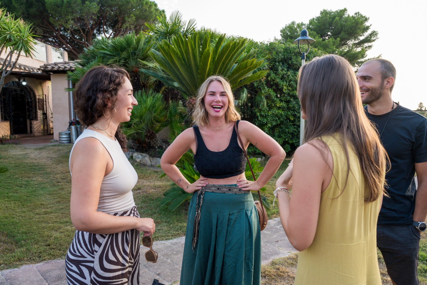
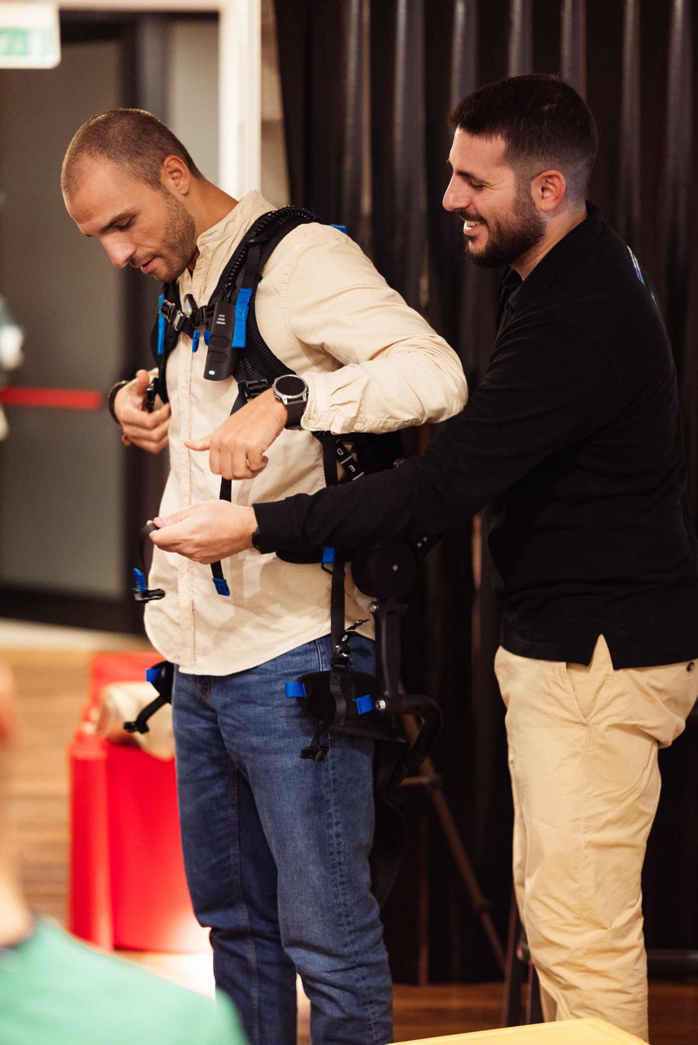
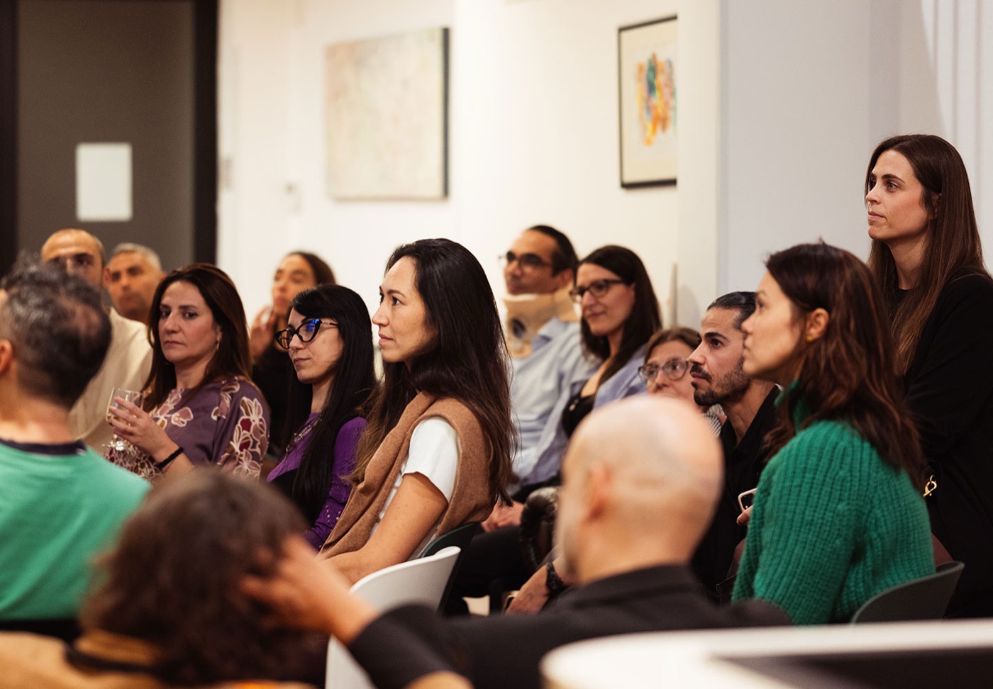
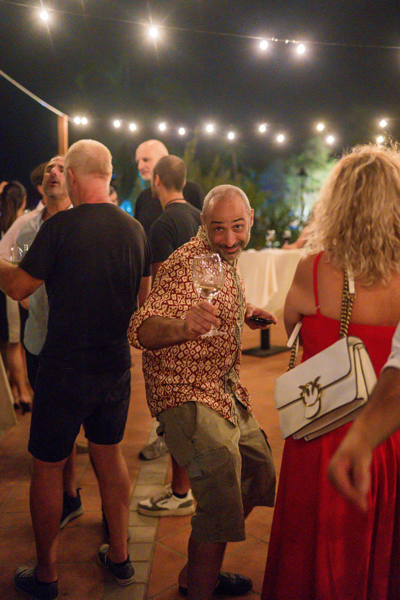
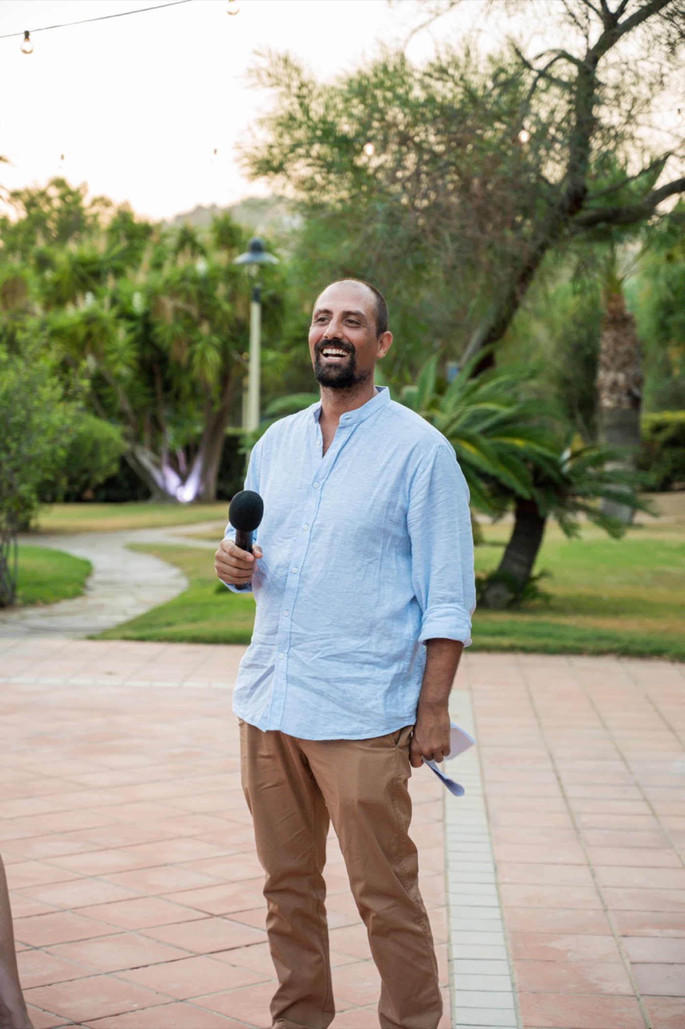
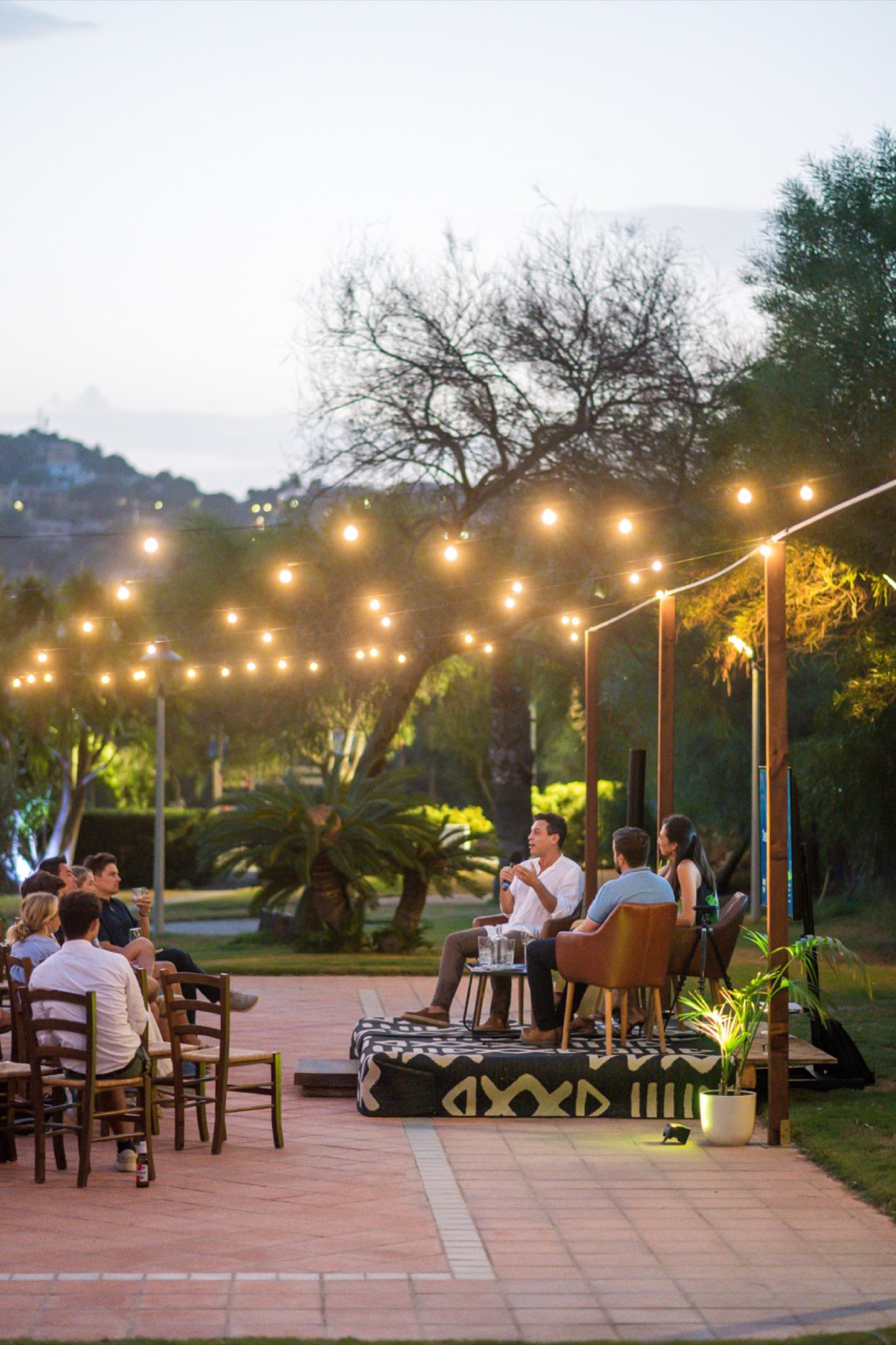
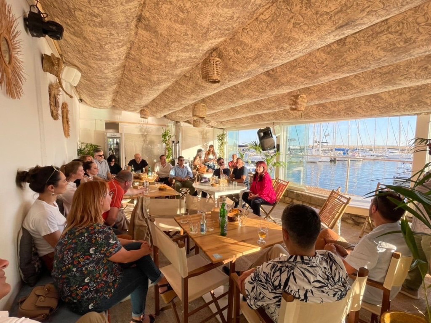
Every image comes from an actual EMC gathering. Natural light, real venues, unposed moments — people mid-conversation, mid-laugh, mid-idea. No staged handshakes, no laptop-on-beach clichés, no stock photography, ever.
Fun mode direction: warm and candid. Crowded frames are good frames — energy over composition. Rooftops, aperitivo tables, Cagliari in the background. Choose the picture where somebody is laughing.
Pro mode direction: clean and aspirational. Wider shots, calmer compositions — panels, venues, the city itself. Choose the picture that says "this is being built seriously." Every photo takes a 1px white frame.
Photos sit in 12px-radius frames and always carry the micro-caption: venue or event, month, year — uppercase, 0.5px tracking, 60% ink. Credit the photographer on the opposite edge when known. Text over photos requires the mode's scrim at 72%.
Section 12
In Practice
Component specimens
The recipes, assembled and live.
Every specimen below is built from the rules in this manual — and re-dresses itself when you flip the mode. If a new component can't be assembled from these parts, question the component before questioning the parts.
Get started
Jump in. The water's warm.
How to get involved
Curious? Good. Join us in Cagliari for your first gathering. No membership required. No pitch expected.
Join us in Cagliari for your first gathering. See what happens when you're in a room with people who are building things — and building up a city too.
"It's a space where people come even if they don't know anyone, grab a beer, and start talking."
"Legitimacy in entrepreneurship comes from personal satisfaction and sustainability."— EMC community member — From an EMC roundtable
Life in the Blue Zone
A city that grows with its people
We're not just building businesses here. We're building lives — where work, health, and happiness actually coexist.
Our mission goes beyond events: attracting values-driven individuals and capital to Sardinia — people who contribute to the island's growth, not just extract from its beauty.
Section 13
Assets & Stewardship
Where everything lives
Single sources of truth.
Master files live in the emc repository. The tokens are code — if a value here ever disagrees with the repo, the repo wins, and this manual gets fixed.
↓ Download the Media Pack zip · 5.9 MB| Asset | Master location | Notes |
|---|---|---|
| Colour & mode tokens | resources/css/app.css · tailwind.config.js | CSS variables (RGB triplets) + emc-* Tailwind tokens. The source of truth for both palettes. |
| Wordmarks (all variants) | resources/images/EM_Logo_*.svg · EMC_logo_extended*.svg | Copies ship with this manual in assets/img/. Never re-export from screenshots. |
| Logomark | resources/images/EMC_LogoMark.svg | Uncoloured master. Recolour per the four recipes in §06 — letterforms in band ink, arrow + spark in the mode accent. |
| Media pack (built) | public/brand-manual/assets/media-pack/ | Generated by npm run media:build from the decks in docs/media-pack/. The downloadable zip is the press-facing bundle. |
| Logo kit (built) | public/brand-manual/assets/logo-kit/ | Generated by npm run logo:build — SVG masters plus PNG/WebP/AVIF/JPG at every size, favicon, and the essentials zip. Never hand-edit; the build wipes the folder. |
| Glyph set | resources/views/themes/emc/components/brand/icon/ | Blade components, currentColor fills. Inline SVGs in this manual match them. |
| Alcyone (full family) | resources/fonts/alcyone-roman · alcyone-italic | woff2/woff/ttf, Thin→Black + italics. Web build declares 300–700 + Regular Italic only. |
| Site copy — Pro voice | resources/markdown/fullsitecopy.md | Canonical Pro copy deck, page by page. |
| Site copy — Fun voice | resources/markdown/FunMode_fullsitecopy.md | Canonical Fun copy deck. |
| Motion keyframes | tailwind.config.js → keyframes/animation | emc-fade-up, emc-lift-up, emc-slide-*, emc-blur-in, emc-rule-draw. |
| Event photography | resources/images/EMC_event_pic*.jpg | Optimised renditions are generated by the responsive-image pipeline. |
When the rules run out
This manual covers the decided cases. New surface, weird constraint, a partner asking for "just a small tweak" to the logo? Don't improvise — ask the EMC design crew first. An exception granted once, on purpose, keeps the system honest; an exception taken quietly becomes a second brand.
This manual is proudly written by humans. Well — assembled by one, at least.
Consistency is what lets a small community look like a movement.
Section 14
Social Media
The social playbook
Three platforms. Three jobs. One community.
Social is where most people meet the brand before they meet the community. Each platform gets one job and one committed register — chosen once, per the mode rules in §04, so nobody decides voice per post.
LinkedIn runs Pro. Instagram and WhatsApp run Fun. The Monthly Mixer is the heartbeat: every month, one campaign moves across all three platforms on a fixed timeline. Between Mixers, each platform carries its own always-on series.
Everything below is buildable from this manual's parts: mode palettes, Alcyone, the glyph set, real event photography with the 72% scrim, and CTAs that end with an arrow. If a template needs a part the manual doesn't have, question the template.
Thought leadership, ecosystem data, recaps with substance, member and company spotlights. Written for investors, institutions, and professionals deciding whether this is serious. It is.
Runs Pro · Blue SlateWhat the room feels like. Event energy, interesting humans, Blue Zone life. Written for the curious person deciding whether to show up on Saturday.
Runs Fun · Coral & IndigoThe community channel. Invites, reminders, day-of updates, thank-yous. Short, warm, useful — the message a friend sends, not a newsletter.
Runs Fun · utility registerThe Mixer campaign — the monthly heartbeat
Every Monthly Mixer runs the same cross-platform timeline: two weeks of build-up, one great night, one proof-post. Fixed rhythm, reusable templates — only the date, venue, and photos change.
-
T−14 · Announce
The date drops
Instagram announcement square + story. WhatsApp invite card to the community. LinkedIn event post (Pro voice) if there's a speaker or partner to name.
IG feed + storyWA inviteLI event -
T−7 · Deepen
Why this one is worth it
Venue reveal or speaker spotlight. Instagram: venue story ("this month we're supporting…"). LinkedIn: speaker or theme post with one substantive hook from their story.
IG storyLI spotlight -
T−1 · Remind
The nudge
WhatsApp reminder with the practical facts (time, address, map pin). Instagram countdown story. Nothing on LinkedIn — professionals don't need a nudge, they need a reason, and they got it at T−7.
WA reminderIG countdown -
Day of · Doors open
Tonight.
Instagram story at doors-open: one photo of the empty venue ready to fill, "Tonight · 19:00". WhatsApp status mirror. During the event: 2–3 candid stories max — be at the event, not on the phone.
IG story ×3WA status -
T+2 · Recap
The proof
Instagram photo-dump carousel ("You had to be there"). LinkedIn recap with the numbers and one idea that surfaced (Pro voice, tag venue and speakers). WhatsApp thank-you + next date teaser. This post is next month's T−14 fuel.
IG carouselLI recapWA thanks
LinkedIn — runs Pro. Data first, personality second.
LinkedIn is where the annual report lives between covers: the ecosystem story, told with evidence, in the Pro register. Blue slate, white ink, steel accents, 1px white frames on photos.
Formats: single image (1200×1200), carousel/document posts (1080×1350 frames, ≤7 slides), text-forward posts with one strong image. Carousels end with a CTA slide, always.
Author mix: ~⅔ from the EMC page, ~⅓ reshared by organisers with a personal line on top. A person saying "this happened in my city" outperforms a logo saying the same thing.
L1 · "The Case for Cagliari" — insight carousel
The flagship awareness series. One claim per month from EMC data or the annual report, unpacked over 4–6 slides. Cover states the claim; slides carry one stat or idea each; final slide is the CTA.
It needs a reason.
It's a place where talent, ideas, capital, and opportunity converge — and the numbers are starting to show it. This month's Case for Cagliari: what 200+ members from 15+ nationalities actually build when they share a table.
→ Full report in the comments.
#Cagliari #Sardinia #Entrepreneurship #Ecosystem
L2–L4 · Roundtable quotes, spotlights, recaps
L2 "From the Roundtable": one idea that actually surfaced at an EMC event, as a quote card — thinking, not motivational wallpaper. L3 "Building from Sardinia": member/company spotlights for institutional eyes. L4 Recap: the numbers post, two days after each Mixer, venue and speakers tagged.
wearable exoskeletons.
Instagram — runs Fun. Show the room; the room does the selling.
Instagram answers one question: what does it feel like to walk in? Coral & indigo, amber highlighter, candid photography, captions in the Fun voice. If a post could be an ad, redo it.
Formats: feed squares (1080×1080) and portraits (1080×1350) for announcements and series; stories (1080×1920) for the campaign beats; carousels for recaps. Grid rhythm: photo-led posts outnumber graphic-led roughly 2:1.
Photography rules apply as-is from §11: real rooms, real people, crowded frames welcome. Graphics use flat brand surfaces — never gradients, never stock.
I1 · Mixer announcement — square, story, day-of
The water's warm.
You won't leave that way.
Sat 4 Oct, 19:00, Marina di Castello. No membership required, no pitch expected, no awkward elevator rounds. Grab a drink and meet the people building things in Cagliari — and actually enjoying life at the same time.
First time? Even better. Link in bio →
#EntrepreneursMeet #Cagliari #Sardinia #BlueZone
I2 · "You had to be there" — recap carousel
T+2 after every Mixer. Slide 1 is the single best photo with a one-liner; slides 2–7 are the photo dump, uncaptioned; last slide plants the next date. Energy over composition — pick the frames where people are mid-laugh.
I3–I5 · Interesting Humans, Blue Zone Life, quote tiles
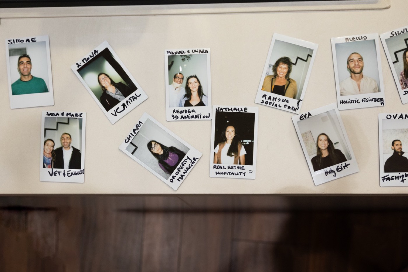
I3 "Interesting Humans": member spotlights, two per month — portrait, first name, what they build, one honest quote. The range is the point. I4 "Blue Zone Life": awareness series, one enviable Sardinia fact per post. I5 quote tiles: community voices on card indigo.
The sea: 15 minutes.
Burnout: optional.
WhatsApp — runs Fun, utility register. The message a friend sends.
WhatsApp is the community's living room — announcements land here first, for the people already in. The register is Fun at its most practical: short, warm, zero filler. One message per beat, never two.
Anatomy of every send: one image card (square, legible at thumbnail size), 2–4 lines of text, one link. Facts up front — date, time, venue — because half the audience reads only the first line on a lock screen.
Emoji: one per message, as seasoning. Voice notes and walls of text: never. The channel stays announcement-only; conversation happens at the events and on the community platform.
 October Mixer 🍋
Sat 4 Oct · 19:00 · Marina di Castello
No membership required — bring a friend who should meet us. First drink's the easy part.
RSVP: emc.link/oct 18:02
19:00 · Marina di Castello (map: emc.link/pin)
Coming alone? Perfect — most of us did the first time. Look for the coral EM sign at the door. 10:31
That was a good one.70+ of you, 12 nationalities, one very patient bartender. Thank you, Marina di Castello.
Next gathering: Sat 8 Nov. Save it. 📆 12:15
Cadence & rules
A month of EMC social is roughly twelve artifacts, most from templates. One volunteer with a phone and this section can run it.
| Week | LinkedIn (Pro) | Instagram (Fun) | WhatsApp (Fun · utility) |
|---|---|---|---|
| 1 | Mixer recap with numbers (L4) | Recap carousel (I2) | Thank-you + next date |
| 2 | Case for Cagliari carousel (L1) | Interesting Humans (I3) | — |
| 3 | Mixer announcement / speaker (L3) | Mixer announcement + story (I1) · Blue Zone Life (I4) | Invite card |
| 4 | Roundtable quote (L2) | Venue story · countdown · day-of · live ×3 | Reminder · day-of status |
| Rule | Do | Don't |
|---|---|---|
| Register | LinkedIn Pro; Instagram & WhatsApp Fun. Committed once, never per post. | ✕ Copy-paste one caption across platforms. |
| Photography | Real events only; scrim at 72% when text sits on photos; credit photographers. | ✕ Stock photos, AI-generated crowd shots, over-filtered edits. |
| Type & colour | Alcyone only; palette per committed mode; amber highlighter ≤ one phrase per artifact. | ✕ New fonts "for variety", gradients, off-palette accents. |
| CTAs | Verb + destination, arrow at the end: "Come to Your First Event →". | ✕ "Don't miss out!", "Last chance!", urgency theatre. |
| People | Name members with permission, first names, what they build. | ✕ Posting faces of attendees who haven't okayed it. |
| Hashtags | Four, always the same base set: #EntrepreneursMeet #Cagliari #Sardinia + one topical. | ✕ Hashtag walls, trending-tag tourism. |
Now go post something a real person would stop scrolling for.
Consistency across twelve artifacts a month is how a community becomes a movement.